September 26th, 2025
13 Best AI Analytics Tools For Real-Time Data I Tested in 2025
By Connor Martin · 21 min read
The best AI analytics tools for real-time data let you spot changes the moment they happen, whether that’s a drop in click-through rates or a sudden spike in failed transactions. Tools like Julius and Splunk approach this differently, from plain-language queries to system monitoring.
I’ve tested 13 options, from BI dashboards to streaming platforms, to see which ones work best for tracking sales, spotting anomalies, and monitoring live events.
The 13 best AI analytics tools for real-time data: At a glance
Real-time analytics platforms vary in focus, from plain-language queries to large-scale stream processing. Some are built for marketers, others for technical teams, and a few can serve both. To help narrow the field, here are 13 tools worth considering:
Julius — Best for plain-language real-time analysis
• Real-time: Native
• Starting price: $29.16/month (billed annually)
• Key strength: Ask questions in chat and get instant chartsDatabricks — Best for enterprise-grade streaming and analytics
• Real-time: Native
• Starting price: Pay as you go
• Key strength: Structured Streaming with ultra-low latencyPower BI — Best for BI dashboards in the Microsoft ecosystem
• Real-time: Native
• Starting price: $14/month (billed annually)
• Key strength: Copilot AI with live dashboard connectionsTableau — Best for business intelligence and visualization
• Real-time: Native
• Starting price: $75/month (billed annually)
• Key strength: Interactive dashboards with live data feedsQlik Sense — Best for AI-driven BI exploration
• Real-time: Native
• Starting price: Custom
• Key strength: Associative engine with natural language queries and streamingThoughtSpot — Best for search-first analytics
• Real-time: Native
• Starting price: $25 per user/month (billed annually)
• Key strength: Conversational queries with anomaly detectionSplunk — Best for log and security analytics
• Real-time: Native
• Starting price: Custom
• Key strength: Real-time monitoring and alertsSisense — Best for embedded real-time analytics
• Real-time: Native
• Starting price: Custom
• Key strength: AI-driven insights with live data connectionsSpotfire — Best for enterprise operational analytics
• Real-time: Native
• Starting price: Custom
• Key strength: Streaming analytics with AI-driven recommendationsH2O.ai — Best for predictive analytics
• Real-time: Capable
• Starting price: Open source or Custom
• Key strength: AutoML with real-time model scoringIBM Watson Studio — Best for enterprise AI and ML
• Real-time: Capable
• Starting price: Pay as you go
• Key strength: Predictive analytics with model governanceDomo — Best for cloud-native BI dashboards
• Real-time: Capable
• Starting price: Custom
• Key strength: Real-time performance monitoring and alerts
• Real-time: Capable
• Starting price: $24/month for 2 users (Cloud, billed annually)
• Key strength: Zia AI assistant for natural language queries
1. Julius: Best for plain-language real-time analysis
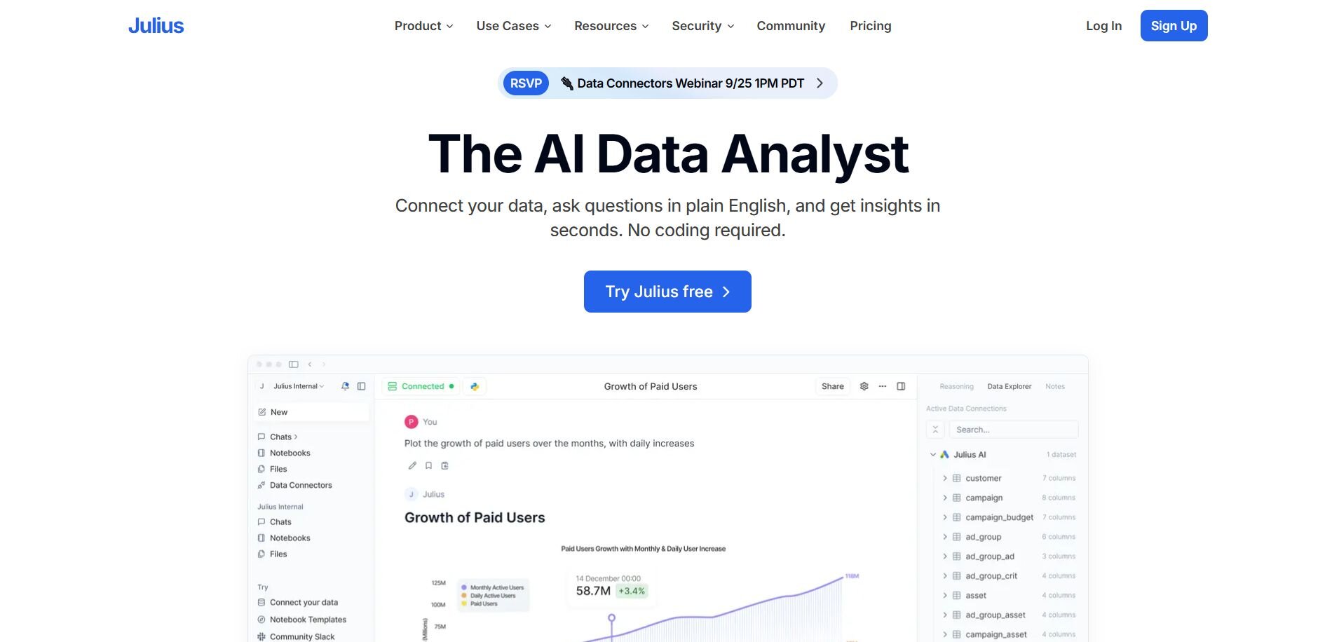
What it does: Julius is an AI analytics platform that turns plain-English questions into instant, real-time charts and tables.
Who it's for: Teams that need quick insights without writing SQL, and data teams that want a faster way to share and automate analysis.
We designed Julius to help teams get answers from data without dashboards or SQL slowing them down. You can type a question like “revenue by region this week” and get a chart with up-to-date results, which makes everyday checks faster.
Julius manages larger datasets by retrying jobs until the output is ready, so you don’t lose time on failed queries. Scheduling lets you set recurring checks that deliver results straight to Slack or email, keeping updates flowing automatically. This helps both business and data teams focus on decisions instead of chasing down reports.
Key features
Natural language queries: Ask questions directly in chat and get charts instantly.
Notebook workflows: Save common analyses, schedule refreshes, and share results automatically.
Data connectors: Connects to major databases and SaaS tools for live data access.
Pros
Removes barriers for non-technical users who just want answers.
Reliable performance on large datasets because of job retries.
Analysts can extend workflows with custom code when needed.
Cons
Visualization options are simpler compared to Tableau or Power BI.
Connecting to some SaaS tools requires initial setup.
Pricing
Starts at $29.16 per month billed annually, for 250 messages to Julius per month.
Bottom Line
Julius is a good fit if you want quick, everyday insights without building dashboards. If you need complex visuals or heavy governance, Tableau or Qlik might make more sense.
2. Databricks: Best for enterprise-grade streaming and analytics
What it does: Databricks is a data and AI platform that combines batch and real-time streaming in one environment. It supports analytics, machine learning, and data engineering on massive datasets.
Who it’s for: Large organizations that need to process high volumes of data in real time and want to run machine learning models directly on that data.
I’ve used Databricks in projects where both historical and streaming data had to be analyzed together. Structured Streaming made it possible to process events as they came in, which was valuable for things like monitoring transactions in near real time.
I also worked with its AI features, using MLflow to train and deploy models and AutoML to build quick baselines before refining them. Running predictive models on live data gave us early warnings and let us act faster. The main challenge was the setup, which took more engineering effort compared to BI tools like Power BI.
Key features
Structured Streaming: Handles live data feeds with low-latency event processing.
MLflow and AutoML: Support training and deploying models directly in the platform.
Unified environment: Runs data engineering, analytics, and machine learning together.
Pros
Works well for high-volume, complex real-time workloads.
Combines streaming, batch, and ML in one environment.
Strong support for data science teams.
Cons
Requires engineering expertise to set up and manage.
More complex than BI-focused tools like Power BI or Tableau.
Pricing
Databricks offers pay-as-you-go pricing, based on compute and storage usage. Costs scale with the size of your workloads. To learn more, you can check out their pricing calculator.
Bottom line
Databricks works for enterprises that need a single platform for both real-time streaming and advanced analytics. If you mainly want dashboards and easy reporting, a BI tool like Tableau or Qlik is a simpler choice.
3. Power BI: Best for BI dashboards in the Microsoft ecosystem
What it does: Power BI is Microsoft’s business intelligence platform that builds interactive dashboards and reports from live data sources. It also includes AI features through Copilot and its built-in machine learning tools.
Who it's for: Teams already using Microsoft services that want real-time dashboards and AI-driven insights without leaving the Microsoft ecosystem.
When I’ve used Power BI, the analytics mostly happened inside the dashboards and reports once the data was connected. Real-time feeds through Azure made it possible to track sales and operations without waiting for batch updates. I also leaned on the data modeling tools, using Power Query to clean inputs and DAX to create calculations that shaped the analysis.
The AI layer added another angle. Copilot let me ask questions in plain language and then suggested visuals, while also surfacing trends I had not flagged myself. The main drawback was the time it took to learn DAX for deeper analysis.
Key features
Copilot AI: Generates visuals and insights from natural language queries.
Real-time dashboards: Connects directly to Azure and Microsoft services.
Data modeling: Flexible transformations with Power Query and DAX.
Pros
Integrates smoothly with Microsoft tools like Azure and Teams.
AI Copilot saves time on building reports.
Strong real-time performance when tied to streaming datasets.
Cons
Advanced features require DAX or Power Query skills.
Works best in Microsoft-heavy environments, less flexible elsewhere.
Pricing
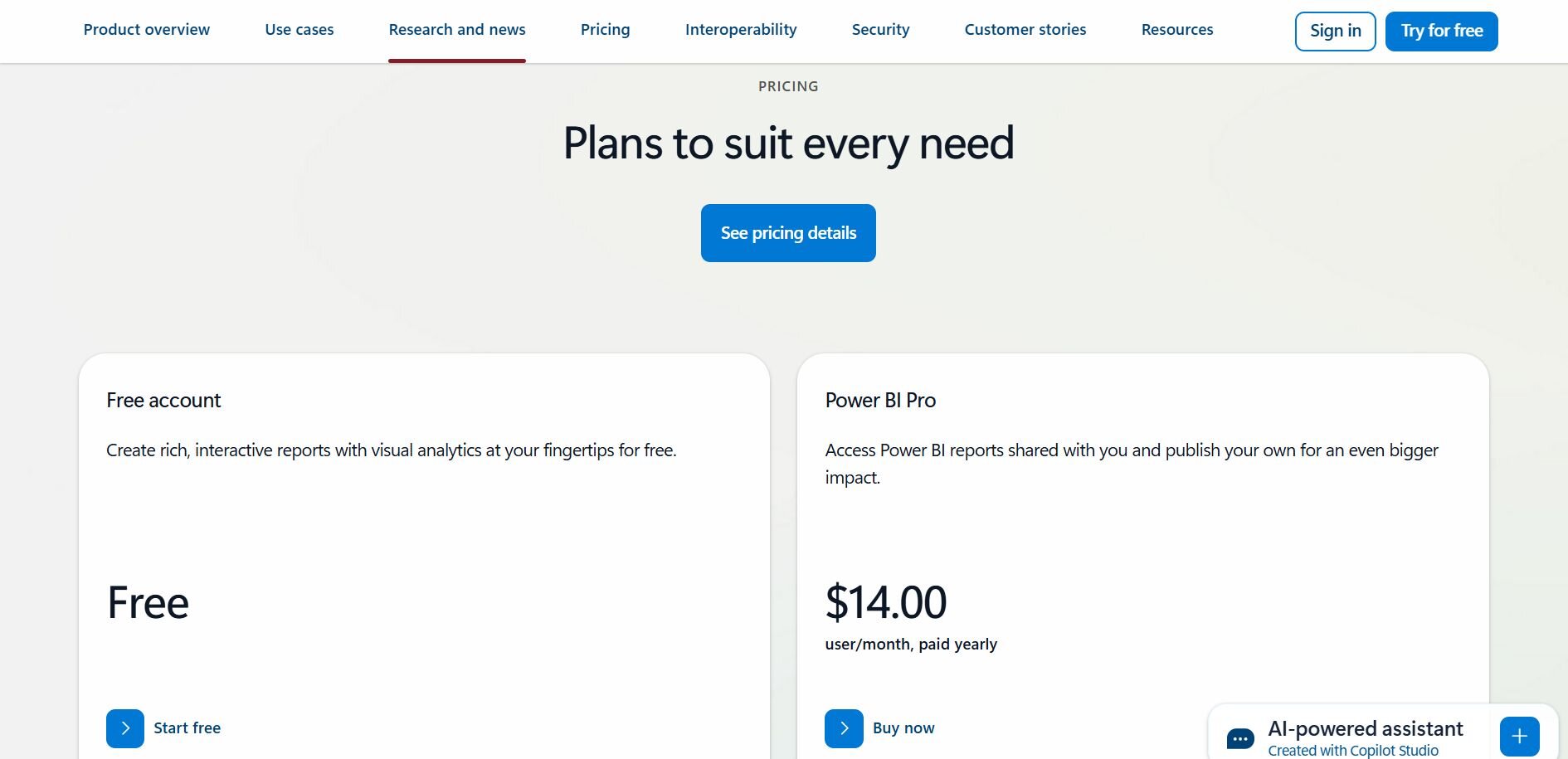
Power BI has a free plan. Power BI Pro starts at $14 per user per month, paid annually.
Bottom Line
Power BI is a strong fit if you’re already invested in Microsoft and want AI-assisted dashboards with live data. If you need more design freedom or cross-platform flexibility, Tableau may be a better option.
4. Tableau: Best for business intelligence and visualization
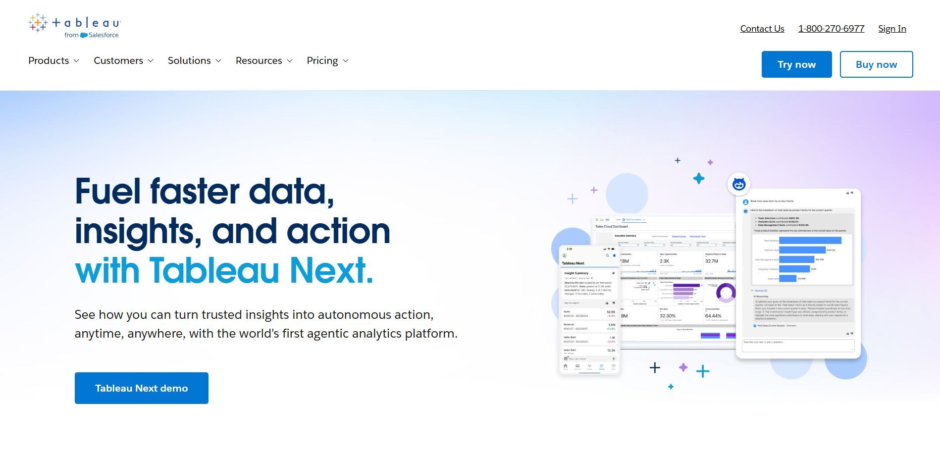
What it does: Tableau is a BI platform that builds interactive dashboards and visual reports from live or stored data. It now includes AI support through Tableau GPT and Tableau Pulse.
Who it's for: Analysts and teams that want a flexible dashboard design and strong data visualization with the option to connect to real-time sources.
One of the things I noticed with Tableau is how much of the analytics happens right inside the dashboards. Connecting it to a live database gave me the ability to track customer activity throughout the day, and the visuals updated as the data changed. The flexibility in how charts and dashboards could be arranged made it easier to share results with non-technical teams.
More recently, the AI features like Tableau GPT and Pulse have helped by suggesting visuals and flagging unusual changes. The main tradeoff I noticed is that new users usually need training before they feel comfortable with it.
Key features
AI support: Tableau GPT for natural language queries and Pulse for monitoring changes.
Live data connections: Pulls directly from databases for real-time updates.
Flexible dashboards: Highly customizable visuals and layouts.
Pros
Strong visualization and dashboard design.
Can work with live connections for real-time analytics.
AI tools reduce manual setup and flag trends.
Cons
Steeper learning curve than simpler BI platforms.
Performance can lag with very large datasets.
Pricing
Starts at $75 per user per month for the Creator license, with lower-cost Viewer and Explorer tiers available.
Bottom Line
Tableau is a solid choice if you need polished dashboards and flexible visuals with AI support. If you want faster setup and less training, Power BI may be easier to adopt.
5. Qlik Sense: Best for AI-driven BI exploration
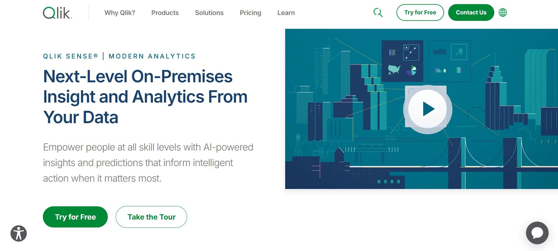
What it does: Qlik Sense is a BI platform that combines an associative data engine with AI features for real-time exploration and visualization. It lets users connect to live data and ask questions in natural language.
Who it’s for: Teams that want to explore data in real time and surface insights quickly, without being limited to fixed dashboard structures.
What stood out to me about Qlik Sense is how freely you can move through data once it’s connected. I wasn’t locked into predefined dashboards. I could filter and pivot in different directions, and the associative engine updated results right away.
The AI assistant also helped by suggesting charts and surfacing relationships I hadn’t set up myself. I found this useful in a case where sales, marketing, and product data needed to be explored together.
One thing I will say is that it might not be as structured for people who prefer traditional dashboards like those in Power BI.
Key features
Associative engine: Updates instantly when data is filtered or rearranged.
Insight Advisor: AI assistant for chart suggestions and insights.
Real-time data connections: Works with live sources for continuous updates.
Pros
Flexible data exploration beyond fixed dashboards.
AI guidance helps surface hidden relationships.
Strong performance with live datasets.
Cons
Less intuitive for users who prefer structured dashboards.
Initial setup can take longer than lighter BI tools.
Pricing
Qlik Sense client-managed pricing is custom. To learn more, contact Qlik.
Bottom line
Qlik Sense works well if you want to explore data from many angles with AI assistance. If you prefer structured dashboards and tighter integration with Microsoft services, Power BI might fit better.
6. ThoughtSpot: Best for search-first analytics
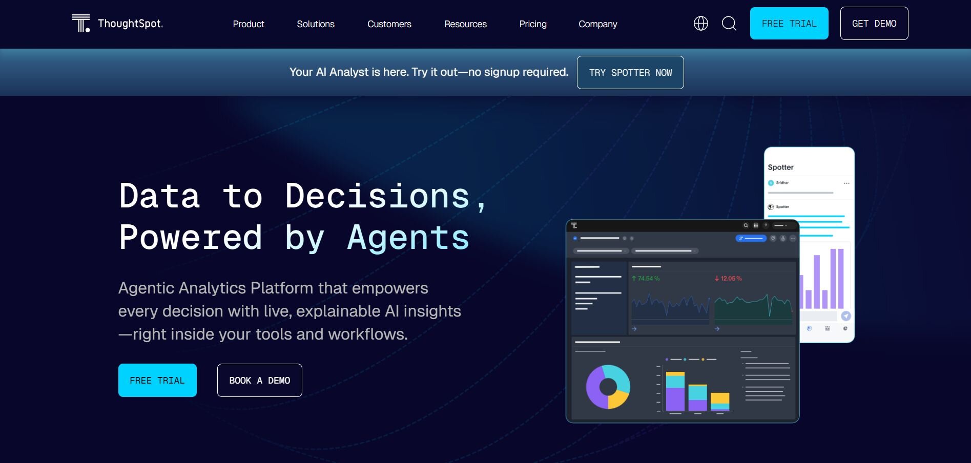
What it does: ThoughtSpot is a search-driven analytics platform that lets users query live data warehouses in natural language and see results as charts or tables. It also adds AI features like anomaly detection and trend surfacing.
Who it’s for: Teams that want fast answers from large data warehouses without building dashboards in advance.
ThoughtSpot works more like a search engine than a traditional BI tool. I could type questions such as “customer churn by region this quarter” and get results directly from the connected warehouse. The analytics ran on top of live data, so the answers reflected the latest records without waiting for a refresh.
I also used the AI-driven features, which flagged unusual changes and surfaced trends I hadn’t planned to look for. That made it easier to catch issues early. The main drawback I noticed was that connecting to very large datasets sometimes slowed performance.
Key features
Search-driven analytics: Ask questions in plain language, get instant charts or tables.
AI monitoring: Highlights anomalies and trends automatically.
Live warehouse connections: Queries run directly on sources like Snowflake, BigQuery, or Redshift.
Pros
Easy for business users to adopt with a search-style interface.
AI insights reduce the need to predefine every metric.
Works well with modern data warehouses.
Cons
Performance can lag on very large datasets.
Less customization compared to traditional dashboard tools.
Pricing
You can try ThoughtSpot for free. Then, plans start at $25 per user per month (billed annually) for up to 25M rows of data.
Bottom line
ThoughtSpot is a strong fit if your team wants search-style analytics on live data. If you need more control over visualization and dashboard design, Tableau or Qlik may be a better option.
7. Splunk: Best for log and security analytics
What it does: Splunk is a platform for searching, monitoring, and analyzing machine data from logs, events, and metrics in real time.
Who it’s for: IT, security, and operations teams that need to monitor systems continuously and act quickly when anomalies occur.
I’ve used Splunk to track application logs and system events during live operations. The analytics happens as the data is ingested, so I could search and filter streams while they were still coming in. One example was monitoring login activity. Splunk flagged unusual spikes, and I could drill into the raw logs to trace the cause.
The AI features also helped by highlighting anomalies without me setting explicit thresholds. While it was powerful for monitoring, I found the setup and licensing model complex, especially when scaling to larger deployments.
Key features
Real-time log ingestion: Processes system and application data continuously.
AI-driven alerts: Detects anomalies and unusual patterns automatically.
Search and drill-down: Query raw machine data for deeper analysis.
Pros
Strong visibility into logs and events in real time.
AI support helps catch anomalies early.
Scales well for enterprise monitoring.
Cons
Pricing and licensing can be difficult to predict.
Requires setup and expertise to get the most value.
Pricing
Splunk offers custom pricing. To learn more, you can get an estimate.
Bottom line
Splunk is good if you need to monitor systems and security events in real time. For teams mainly looking for dashboards or business KPIs, a BI tool like Tableau or Power BI is easier to adopt.
8. Sisense: Best for embedded real-time analytics
What it does: Sisense is a BI and analytics platform that focuses on embedding dashboards and AI-driven insights directly into applications or workflows.
Who it’s for: Product teams and businesses that want to deliver real-time analytics inside their own tools or need customizable dashboards for different stakeholders.
When I tried Sisense, I used it in a project where analytics had to be built into another application instead of a separate BI portal. It connected to live databases, so the dashboards updated as new records came in.
In one case, I embedded user behavior metrics directly into a customer-facing app, which gave end users access to insights without switching tools. The drawback I found was that deeper customization required more setup than lighter BI platforms such as Zoho Analytics.
Key features
Embedded analytics: Place dashboards directly into applications or portals.
AI-driven insights: Detects anomalies and supports natural language queries.
Live connections: Works with real-time databases for up-to-date results.
Pros
Strong option for embedding analytics into products.
AI support makes insights easier to surface.
Handles live data connections reliably.
Cons
More complex to customize deeply.
Licensing can be harder to navigate for smaller teams.
Pricing
Sisense offers custom pricing. To learn more, you can get a quote.
Bottom line
Sisense is a good choice if you want real-time analytics built into your own applications. If you only need standalone dashboards, simpler tools like Power BI or Zoho Analytics may be easier to work with.
9. Spotfire: Best for enterprise operational analytics
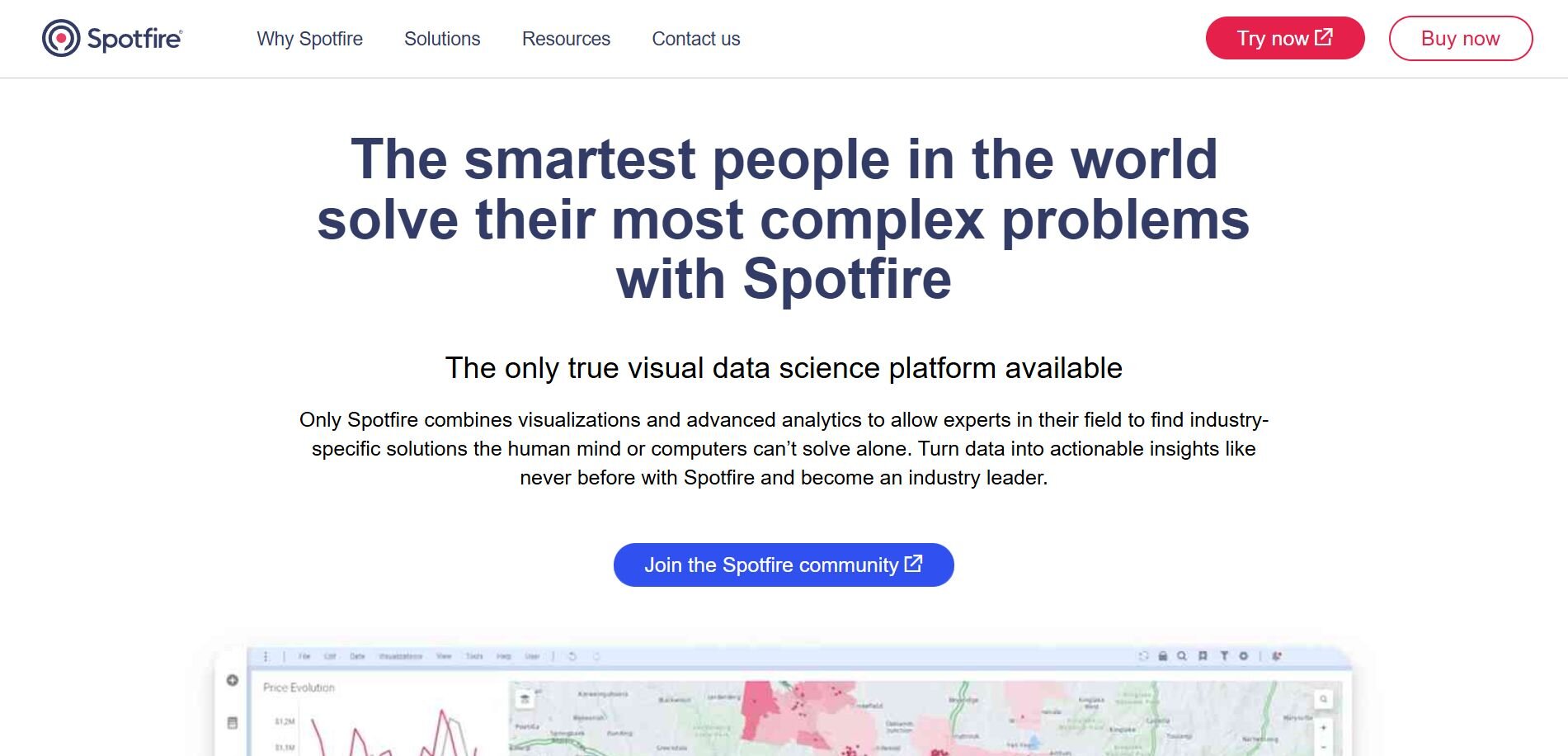
What it does: Spotfire is an analytics platform that combines real-time streaming with AI-driven recommendations and visualization.
Who it’s for: Enterprises that need to monitor operations continuously, such as energy, manufacturing, or finance teams working with high-volume data.
When I tested Spotfire, I focused on a dataset of sensor readings that streamed in throughout the day. Spotfire let me build a live dashboard where charts updated automatically as the feed changed, so I didn’t have to reload or refresh. The analytics happened right on the stream, which meant I could layer calculations and highlight rules directly on top of the incoming data.
The AI features also helped by suggesting scatterplots and time-series views I might not have considered, and it highlighted anomalies where temperature values spiked outside expected ranges. That saved time compared to setting up manual thresholds.
Key features
Streaming analytics: Works with IoT and operational data in real time.
AI recommendations: Suggests visuals and surfaces anomalies automatically.
Custom dashboards: Flexible layouts for monitoring and reporting.
Pros
Handles large-scale operational data in real time.
AI support reduces manual setup for monitoring.
Strong fit for industries with continuous data.
Cons
Interface can feel complex for new users.
Pricing is quote-based, which makes costs harder to plan.
Pricing
Spotfire offers custom pricing. To learn more, you can contact them.
Bottom line
Spotfire is a strong choice if your organization needs continuous operational analytics on live data. If you want something easier for everyday reporting, a lighter BI tool like Power BI may be more approachable.
Special mentions
Not every analytics platform is built to process streaming data natively, but several can still be set up for real-time use. These tools often shine in predictive modeling, governance, or BI dashboards where near real-time performance is good enough. Here are the other tools I keep in my back pocket:
H2O.ai: I tested H2O.ai for AutoML and predictive modeling. It was easy to spin up baseline models and deploy them for real-time scoring, but it required integration with other systems to feel seamless in production.
IBM Watson Studio: I used Watson Studio to build and manage machine learning models on enterprise data. It handled governance and deployment well, though real-time analytics only worked smoothly when paired with streaming services.
Domo: I tried Domo for cloud-based dashboards with AI alerts. It helped monitor KPIs across multiple data sources in near real time, but customization sometimes felt limited compared to heavier BI platforms.
Zoho Analytics: I worked with Zoho Analytics on a project where affordability mattered. Its Zia AI assistant let me query in plain language, and dashboards updated frequently enough for everyday reporting, though it lacked the depth of enterprise tools.
How I tested these AI analytics tools
To see how each data analytics tool really worked, I connected them to live datasets from ad campaigns, web analytics, and financial records. I watched how quickly the numbers updated when new data came in, since even a small delay can matter if you are tracking conversions or transactions in real time.
I also paid close attention to:
Ease of setup: I looked at how quickly I could connect a source without leaning on engineers.
Latency: I checked how fast dashboards and queries reflected new data.
Actionability: I paid attention to whether the insights included suggestions, anomaly detection, or trends I could act on.
Collaboration: I tested how easily results could be shared through Slack, email, or exports.
Scalability: I noted how well each tool handled larger datasets without slowing down.
AI support: I tried features like natural language queries, auto-generated visuals, and predictive insights to see if they saved time.
Customization: I checked whether I could adjust dashboards, alerts, and workflows to match real business needs.
How to choose your real-time AI data analytics tool
Some tools are built for large enterprises running heavy data streams, while others focus on making everyday reporting faster and easier for business teams.
Here’s a quick guide that might help you choose:
Julius
• Choose if: You need plain-language queries, fast answers without SQL, and recurring reports sent to Slack or email.
• Avoid if: You only need basic static reports that Excel or Sheets can handle.Databricks
• Choose if: You manage massive datasets, need both historical and streaming analysis, and want to deploy ML models on real-time streams.
• Avoid if: You don’t have engineering support to manage setup and scaling.Power BI
• Choose if: You work in the Microsoft ecosystem, want AI Copilot to build visuals, and need live dashboards tied to Azure or Excel.
• Avoid if: You want more design flexibility outside Microsoft tools.Tableau
• Choose if: You care most about polished, flexible dashboards and want AI features like Tableau GPT and Pulse.
• Avoid if: You need a tool with a shorter learning curve.Qlik Sense
• Choose if: You want flexible data exploration with its associative engine and AI-driven insights.
• Avoid if: You prefer fixed, structured dashboards like those Power BI offers.ThoughtSpot
• Choose if: You need search-first analytics that works like a data search engine and surfaces anomalies in live data.
• Avoid if: You want full control over visualization design.Splunk
• Choose if: You work in IT, operations, or security and need real-time log and system monitoring with AI alerts.
• Avoid if: You only need business KPIs or lightweight dashboards.Sisense
• Choose if: You need to embed real-time analytics into applications and give non-technical users AI-driven queries.
• Avoid if: You only want standalone dashboards with minimal setup.Spotfire
• Choose if: You monitor continuous sensor or operational data and want AI recommendations for visuals and anomalies.
• Avoid if: You need a lightweight BI tool for day-to-day business reporting.
My final verdict
Julius is a great tool if you need quick, real-time answers without building dashboards or writing SQL. But if you need highly customized visuals, heavy governance, or large-scale stream processing, it may not be the right choice.
The best AI analytics tool for you depends on your priorities. Databricks and Spotfire are stronger fits for enterprises with massive data streams and engineering resources.
Power BI, Tableau, and Qlik Sense are better if your team needs polished dashboards with AI support. And finally, ThoughtSpot and Sisense work well when accessibility and speed to insight matter most.
How Julius can take your business intelligence dashboard further
The best AI analytics tools for real-time data help you track performance as it happens, but many of them require setup, training, or upkeep that slows teams down. Julius gives you the same live visibility with less friction, making it easier to ask questions, share results, and keep reports current.
Here’s what you can do with Julius:
Ask questions in plain English: Type “Show revenue by product line” or “Customer churn over the last 90 days” and get a chart back without touching SQL.
Connect to your data sources: Link popular warehouses and databases like Postgres, Snowflake, and BigQuery. For SaaS tools such as ad platforms or billing systems, you can use available connectors or bring data in through files or APIs.
Schedule recurring reports: Send weekly or monthly updates straight to email or Slack.
Export board-ready reports: Create shareable charts and summaries for meetings or investor updates without extra formatting work.
Save repeatable notebooks: Lock in an analysis, like a churn breakdown or cash flow report, and rerun it with fresh data whenever you need it.
Ready to go beyond static dashboards? Try Julius for free today.
Frequently asked questions
What makes AI for data analytics different from traditional reporting?
AI for data analytics automatically detects patterns, anomalies, and trends in real time, while traditional reporting only shows static summaries based on predefined metrics. This means AI tools can surface issues you didn’t plan to track and give you faster insights when conditions change.
Can small teams benefit from data analysis software?
Yes, small teams can benefit from data analysis software when they need insights quickly without hiring a full data department. Tools with plain-language queries and automation make it easier to pull reports, track KPIs, and share updates. Even if your data volume is smaller, having live visibility helps you respond faster to sales changes or marketing performance.
Do AI analytics tools work with existing business systems?
Yes, most AI analytics tools connect directly with your current systems, enabling real-time data analysis across sources like Salesforce or Google Ads.
