November 19th, 2025
11 Best Statistical Analysis Tools: Features & Pricing in 2025
By Drew Hahn · 9 min read
After testing dozens of statistical analysis tools for business and research, these 11 stood out for their accuracy, pricing transparency, and overall performance in 2025.
11 Best statistical analysis tools: At a glance
Some tools for statistical analysis make data reporting faster for business teams, while others focus on deeper analysis and forecasting. Each one offers a different mix of features, pricing, and user control. Here’s how the top 11 compare:
Tool | Best For | Starting Price (Billed Annually) | Key Strength |
|---|---|---|---|
AI-powered analysis and visual reporting | Conversational queries and automatic chart generation | ||
Business dashboards and data visualization | Easy-to-build interactive visuals | ||
Performance tracking and process improvement | Clear charts for quality and operations analysis | ||
Market research and advanced modeling | $99/month per user for the base subscription | Reliable regression and multivariate testing | |
Predictive analytics for enterprise teams | Cloud-based ML pipelines and scalability | ||
Interactive reports and exploratory data analysis | Real-time graph updates and design of experiments | ||
Everyday reporting and simple data summaries | Familiar interface with built-in formulas | ||
Process control and performance analysis | Automated control charts inside Excel | ||
Advanced data modeling and academic research | Free | Extensive libraries for statistical analysis | |
Custom data pipelines and automation | Free | Flexible libraries like NumPy and Pandas | |
AI-driven analytics and data workflows | $19/month, billed monthly | Visual workflow builder for analytics |
1. Julius: Best for AI-powered analysis and visual reporting
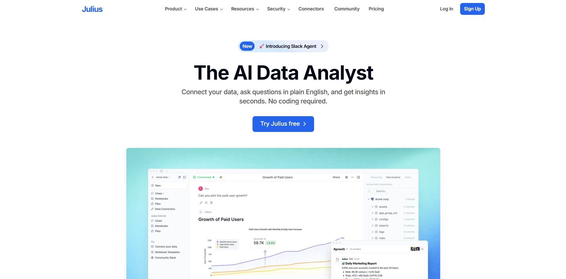
What it does: Julius is an AI-powered data analysis platform that converts raw business data into visual charts and summaries. It connects with sources like Google Ads, Snowflake, Postgres, and Excel, so you can analyze marketing, finance, and operational performance across tools without coding.
Who it’s for: Business and operations teams that want to explore connected data and build visual reports without technical setup.
We built Julius to make analysis more accessible for teams that work with data every day. After connecting your sources, you can ask questions in natural language like “Show sales by region for last quarter” or “Compare ad spend to signups.” Julius writes the queries, combines the data, and shows the results in charts you can review or share.
You can use Notebooks to save analyses and run them automatically when new data updates. This helps track ongoing metrics such as revenue growth, campaign results, or customer activity over time.
The platform also includes a semantic layer that learns how your tables relate to one another, such as linking customers to orders or dates to revenue. This lets Julius interpret questions more accurately and return consistent results without requiring manual mapping each time.
You can export your reports as CSV, PDF, or image files and share them directly with your team.
Key features
Natural language analysis: Ask data questions and receive visual answers
Connected data sources: Integrates with Snowflake, BigQuery, Postgres, and Google Ads
Automated reporting: Schedule dashboards to update and share automatically
Notebooks for repeatable analysis: Save, reuse, and rerun queries with current data
Semantic learning: Recognizes how tables relate for faster, more reliable results
Pros
Quick setup for non-technical users
Consistent and clear visual summaries
Repeatable reports through Notebooks
Cons
Limited for advanced or statistical modeling
Works best with connected, structured data sources
Pricing
Julius plans start at $16 per month.
Bottom line
Julius helps teams explore and visualize connected business data through plain language queries and reusable reports. You may find it useful for ongoing analysis and trend tracking, but if you’re focused on predictive modeling or academic research, tools like Python, R, or SAS Viya might fit better.
2. Tableau: Best for business dashboards and data visualization
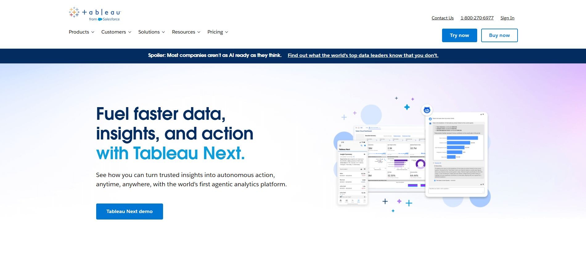
What it does: Tableau helps teams build interactive dashboards that track performance in real time. It connects to Excel and Google Sheets as well as cloud platforms like Salesforce to make results easy to explore and share.
Who it’s for: Teams that need to present data visually and share live dashboards across departments or clients.
I used Tableau for years to build dashboards that tracked sales, ad performance, and customer metrics across teams. Setting up data connections took some time, but once everything was linked, creating visuals was simple.
I could drag fields onto the canvas, compare metrics by date or region, and spot trends without exporting data elsewhere. The dashboards were useful for presentations since they updated automatically whenever source data changed.
What stood out most was how much control I had over formatting and calculations, though customizing deeper logic sometimes required help from technical users. Sharing reports through Tableau Cloud or exporting them for meetings made it a practical choice for ongoing business reviews.
Key features
Interactive dashboards: Visualize KPIs and performance trends in real time
Data connections: Integrates with spreadsheets, databases, and cloud apps
Custom calculations: Create formulas to measure business-specific metrics
Pros
Visual, intuitive interface
Strong sharing and collaboration options
Works well with both small and large datasets
Cons
Can feel complex for first-time users
Advanced customization may require training
Pricing
Tableau Creator licenses start at $75 per user per month.
Bottom line
Tableau makes it easier to see and share your data through interactive dashboards. It’s helpful for tracking performance across teams, but if you want tools that handle reports automatically or use natural language, Julius or Power BI might work better.
3. Minitab: Best for performance tracking and process improvement
What it does: Minitab is one of the most recognized statistical software packages for process improvement and quality control. It supports regression, control charts, and capability analysis to monitor processes and spot variation.
Who it’s for: Teams focused on quality control, manufacturing, or continuous improvement.
When I first worked with Minitab, I used it to review production data and service metrics. Control charts made it easy to see when processes slipped out of range, and capability tools showed which steps needed review.
Running regressions helped me identify which inputs drove variation, and the guided analysis menu was helpful when I wasn’t sure which test to run.
I usually prepared data in Excel, then imported it into Minitab to keep files organized. Minitab proved reliable for recurring process checks and weekly quality reviews, especially when teams needed results that were clear and consistent.
Key features
Control charts: Monitor process stability
Regression tools: Test relationships across variables
Capability analysis: Compare output to required specs
Pros
Clear charts for process work
Helpful guided analyses
Smooth Excel handoff
Cons
Older-looking interface
Not built for advanced predictive modeling
Pricing
Minitab starts at $1,851 per year.
Bottom line
Minitab helps you measure process stability and find where variation hurts results. It’s useful for manufacturing or service quality reviews, but if you want predictive models or wider automation, KNIME or SAS Viya might fit better.
4. IBM SPSS Statistics: Best for market research and advanced modeling
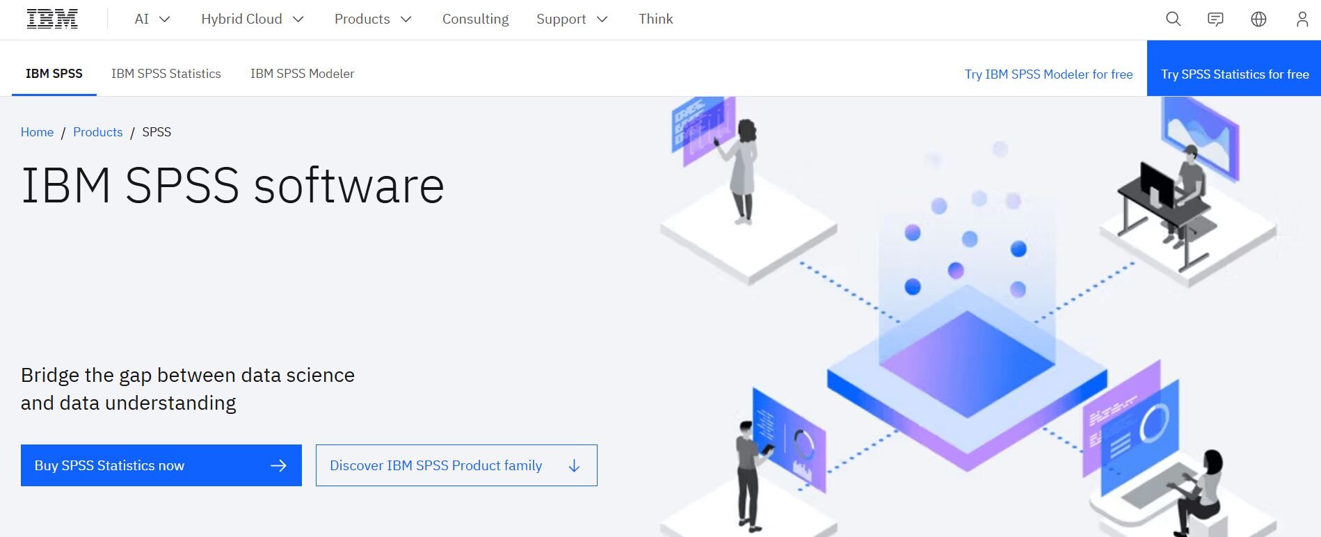
What it does: SPSS is statistical software for data analysis that runs tests, regressions, and factor analysis on structured datasets and surveys. It manages large files reliably and lets you save repeatable steps with syntax.
Who it’s for: Analysts and researchers working with surveys, experiments, or large, clean datasets.
I focused on how SPSS handled large survey datasets and complex models during my testing. It managed thousands of rows without slowing down, which made it dependable for testing different analysis methods.
Menus made quick checks simple, and switching to syntax helped me create repeatable workflows. That mix worked well for verifying results and running multiple regressions back-to-back.
SPSS handled errors gracefully and produced consistent outputs, even under heavy processing. The interface was a bit dated, but its structure made sense once I got used to it. I also liked how SPSS stored variable labels and metadata within each file, which made large datasets easier to audit and understand later.
Key features
Statistical testing: ANOVA, regression, and t-test
Data management: Clean and label large files
Syntax automation: Save and rerun workflows
Pros
Reliable with big datasets
Wide range of statistical tests
Repeatable with syntax
Cons
Dated interface
Limited chart design
Pricing
The base subscription starts at $99 per user per month.
Bottom line
SPSS helps you run complex tests and keep methods consistent across studies. It’s dependable for survey and research work, but if you need richer visuals or interactive dashboards, Tableau or Minitab may suit you better.
5. SAS Viya: Best for predictive analytics for enterprise teams
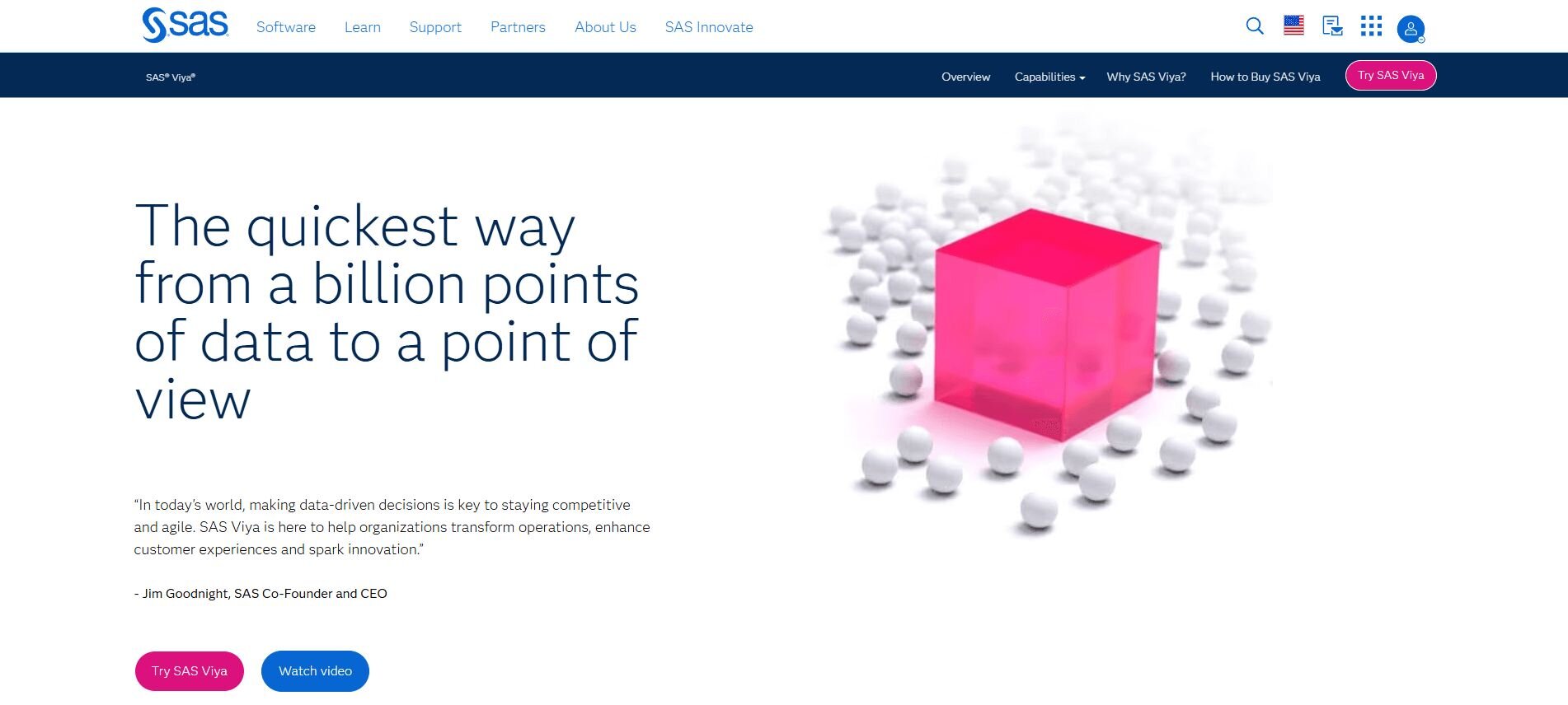
What it does: SAS Viya lets teams prepare data, build predictive models, and share results securely in the cloud. It supports governed projects and connects with code in Python or R.
Who it’s for: Enterprise teams that need scalable analytics, version control, and secure collaboration.
I tested SAS Viya on a project that joined marketing and finance data. Its cloud-based interface made setup faster since everything ran in the browser. I could build models, check lift charts, and share results without installing anything locally.
Pipelines helped me track steps from prep to scoring. When I needed custom code, I called Python or R from the same environment. That mix kept work in one place.
Viya handled larger tables well after we tuned resources. The trade-off was setup time and training. Once roles and access were in place, handoffs between teams were clean and auditable.
Key features
Predictive modeling: Train and compare models
Cloud projects: Share results securely
Integration with open-source code: Run Python or R scripts directly inside Viya
Pros
Scales with data and users
Strong governance
Flexible with code
Cons
Setup can be complex
Training required for depth
Pricing
Pay-as-you-go based on cloud usage.
Bottom line
SAS Viya supports large teams that need governed modeling and shared pipelines. It’s one of the most scalable statistical analysis programs for enterprise environments, but if you want an easier start for mixed skill levels, Julius or KNIME might be a better first step.
6. JMP: Best for interactive reports and exploratory data analysis
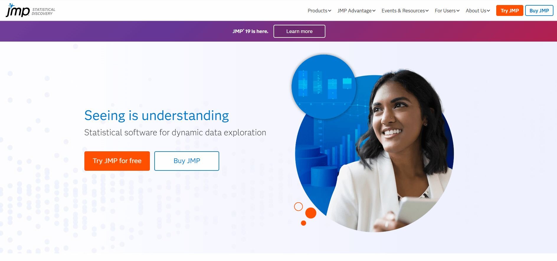
What it does: JMP combines data visualization and statistics in one workspace. It lets users explore datasets interactively, test hypotheses, and identify trends without heavy coding.
Who it’s for: Analysts and engineers who need to investigate patterns and share findings visually.
I worked in JMP to explore datasets that needed quick visual feedback. Changing variables updated charts right away, which made it easier to test relationships and spot patterns. The interface offers a more interactive workflow than menu-driven tools like SPSS, which helped me understand results faster during early testing.
Its scripting language helped automate recurring reports and create control charts for project reviews. The learning curve was moderate, but once I got comfortable with it, the automation saved time by cutting out spreadsheet steps and reducing manual errors.
Sharing results was simple through interactive HTML exports that opened in a browser without any setup, making collaboration straightforward for other team members.
Key features
Interactive visuals: Adjust data and see changes quickly
Scripting (JSL): Automate recurring reports
Data discovery: Detect outliers and correlations quickly
Pros
Fast visual feedback
Good balance between code and UI
Exports interactive dashboards
Cons
Limited real-time collaboration
Requires training for scripting
Pricing
JMP costs $1,320 per user per year.
Bottom line
JMP helps you explore data visually and uncover relationships faster. It’s useful for testing ideas and building reports, but if your goal is automated dashboards or connected sources, Tableau or Julius might fit better.
7. Microsoft Excel: Best for everyday reporting and simple data summaries
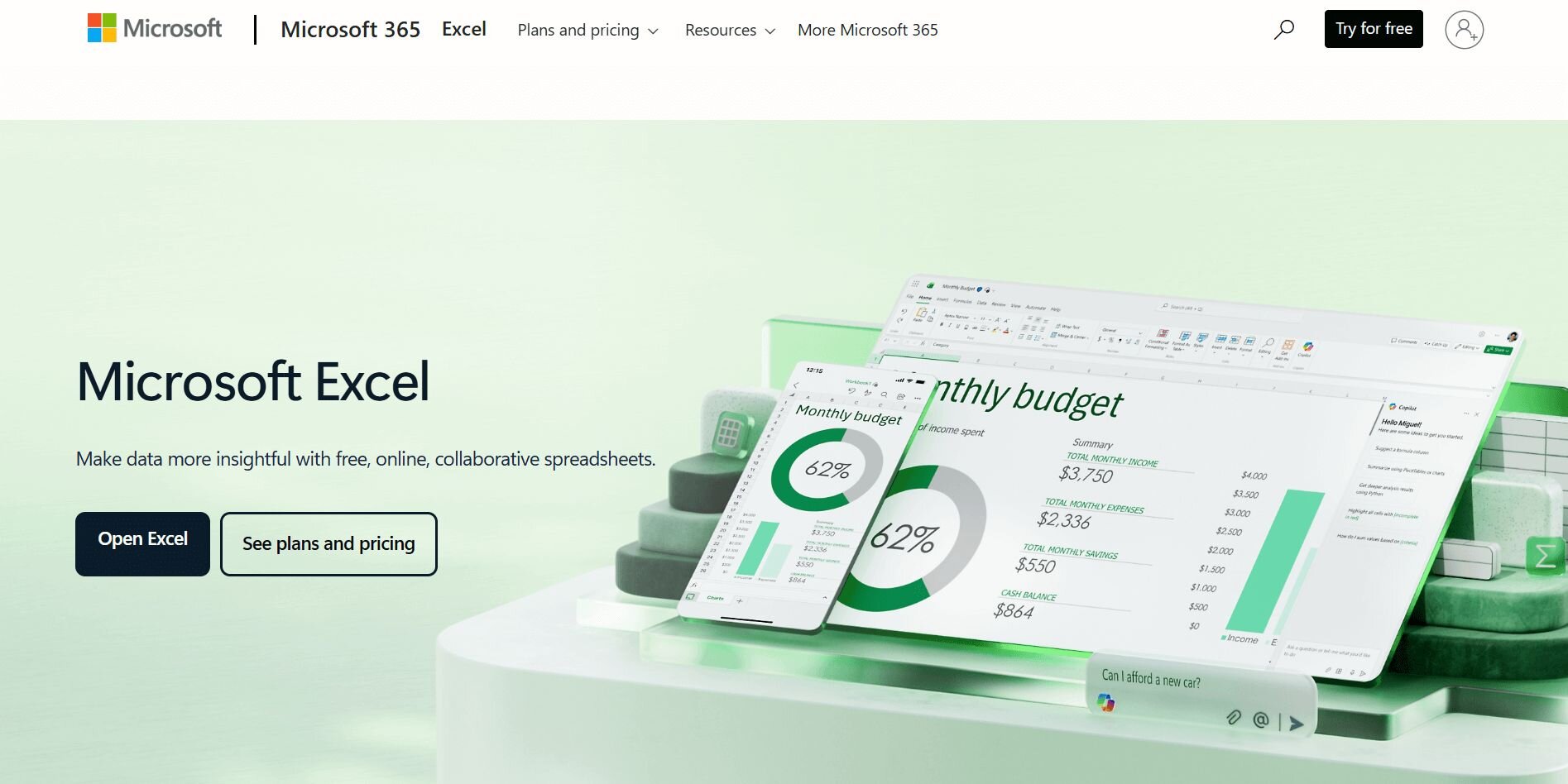
What it does: Excel stores, organizes, and analyzes tabular data through formulas, pivot tables, and charts. It’s widely used for quick calculations and summary reports.
Who it’s for: Professionals who need a flexible, accessible tool for small- to mid-size datasets.
I’ve used Excel for everything from budget tracking to performance summaries. Pivot tables make it easy to group results and calculate averages or totals without external software.
Conditional formatting helps highlight values that fall outside goals, which speeds up reviews. I often combine formulas like IF and VLOOKUP to automate small checks across sheets.
While Excel can handle moderate datasets, it slows once files grow large or formulas stack up. For complex models, I export data to specialized tools, but for daily tracking and quick reviews, it remains the fastest option.
Key features
Pivot tables: Summarize and group data quickly
Formulas: Build custom logic for calculations
Built-in charts: Display data trends directly inside worksheets
Pros
Familiar and accessible
Strong formula flexibility
Integrates with most systems
Cons
Limited collaboration on large files
Prone to manual errors
Pricing
Excel is included in Microsoft 365 starting at $6 per user per month.
Bottom line
Excel helps you manage and summarize everyday data without extra setup. It’s practical for small teams and quick insights, but if you need advanced analytics or AI-driven reporting, Julius or Python could be a better fit.
8. QI Macros for Excel: Best for process control and performance analysis
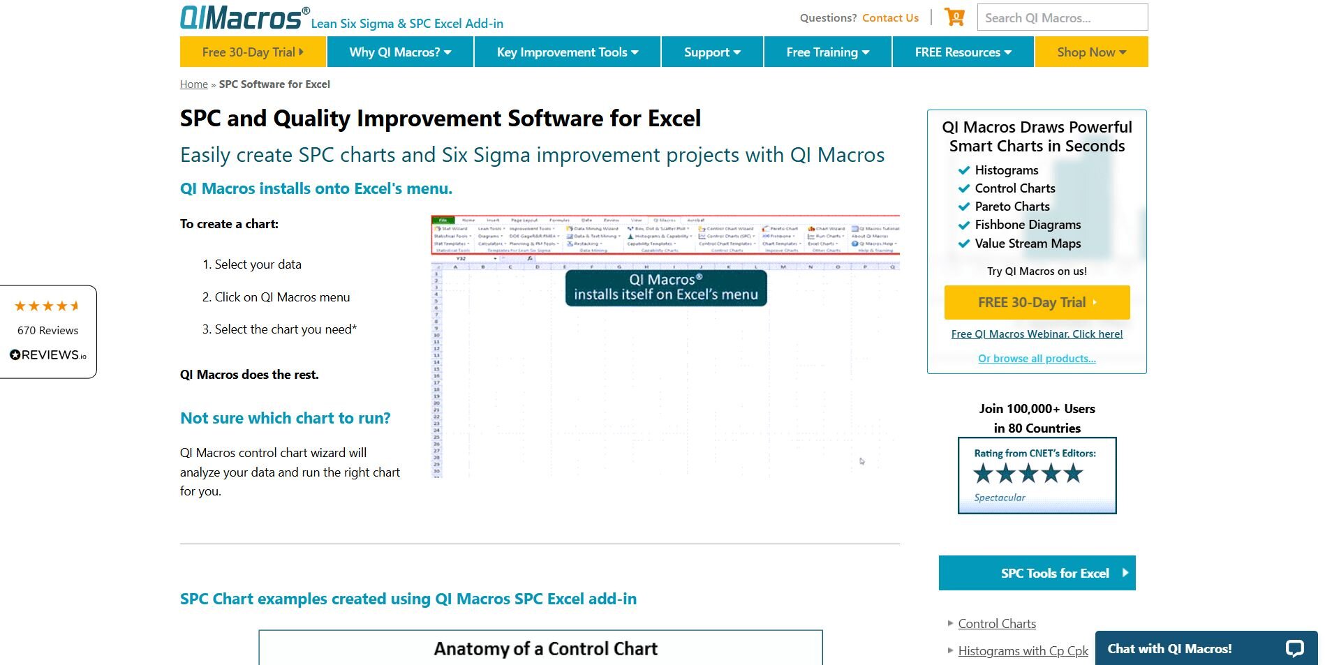
What it does: QI Macros adds statistical process control tools to Excel. It automates charts and calculations for quality checks and Six Sigma analysis.
Who it’s for: Teams that monitor production quality or service consistency inside Excel.
I tested QI Macros on sample data to see how well it handled quality metrics like call-center performance and production output. It simplified control charts and Pareto analyses that would otherwise take hours to build manually.
After selecting a dataset, I could choose the chart type from the add-in menu and get results quickly. The templates covered most scenarios, though customizing layouts required some trial and error.
It’s best for users already comfortable in Excel who need fast statistical process control (SPC) outputs without learning new software.
Key features
Control charts: Monitor stability over time
Pareto charts: Identify main problem areas
SPC templates: Automate standard quality reports
Pros
Easy add-in setup
Saves time for SPC tasks
Good for non-technical users
Cons
Customization can be limited
Slower on very large datasets
Pricing
You can get Qi Macros for a one-time purchase of $375.
Bottom line
QI Macros brings process-control tools into Excel so you can spot quality issues faster. It’s practical for lean and Six Sigma teams that track production quality, but for broader analytics or visualization, Minitab or Tableau may serve you better.
9. R: Best for advanced data modeling and academic research
What it does: R is an open-source language often used alongside statistical data analysis tools to manage complex datasets and build visual reports. It supports libraries for regression, time-series, and multivariate analysis.
Who it’s for: Researchers and analysts comfortable with code who need full control over statistical methods.
I started using R to test statistical methods that other tools couldn’t run as flexibly. It offered full control over data cleaning, modeling, and visualization.
I used packages like dplyr for preprocessing and ggplot2 for visuals that could be adjusted easily. Once the code was written, rerunning analyses with new data was pretty quick. That consistency made R useful for ongoing experiments and comparisons.
R required more setup time than GUI-based tools, but the transparency and precision were worth it. Every calculation and step stayed visible, which made reviewing work simple and reliable.
Key features
Extensive libraries: Regression, clustering, and more
Visualization tools: Create customizable plots and graphics
Open source: Free with active community support
Pros
Highly customizable
Wide method coverage
Free to use
Cons
Requires coding knowledge
Slower for large data prep
Pricing
R is free to download.
Bottom line
R gives you control over how analyses run and how results appear. You may find it powerful for research or modeling, but if you prefer a visual interface or guided setup, SPSS or JMP could be easier to manage.
10. Python: Best for custom data pipelines and automation
What it does: Python is a general-purpose language with libraries for statistics, data analysis, and machine learning. It’s used to build repeatable workflows and automation scripts.
Who it’s for: Analysts and developers who want to code custom analyses or integrate data into applications.
I used Python to automate recurring reports that normally took a lot of manual work in Excel. With libraries like Pandas and NumPy, I could clean and organize data before sending it to visualization tools.
Matplotlib and Seaborn handled charts directly in code, which kept everything reproducible. Jupyter Notebooks made documenting results easy since the code and outputs appeared together.
While setup took more time than point-and-click tools, Python made scaling and automation simple once scripts were in place. In my experience, Python works best when workflows require both analysis and system integration.
Key features
Data libraries: Pandas, NumPy, SciPy for analysis
Visualization: Matplotlib and Seaborn for charts
Automation: Build repeatable scripts and pipelines
Pros
Free and flexible
Works with many databases
Great for automation
Cons
Coding required
Less visual out of the box
Pricing
Python is free to download.
Bottom line
Python helps you automate analysis and build repeatable workflows with full control over data. It’s strong for technical projects, but if you want ready-made visuals or guided reports, Tableau or Julius might save time.
11. KNIME: Best for AI-driven analytics and data workflows

What it does: KNIME is a data analytics platform that lets you build workflows for data preparation, modeling, and visualization. It combines drag-and-drop controls with machine learning integrations.
Who it’s for: Teams that want to automate analytics and connect multiple data tools in one workspace.
I tested KNIME to see how well it managed automation without relying on code. Building workflows was straightforward once I dragged in nodes for importing, transforming, and exporting data.
After linking spreadsheets and databases, I added models to predict campaign conversions and performance trends. Each flow ran efficiently once built, though organizing larger projects needed planning.
Reusing workflows made updates faster, and the AI extensions added flexibility when testing new methods. Exporting both visuals and logic kept collaboration simple since teams could review the process behind each result.
Key features
Visual workflows: Build data pipelines with drag-and-drop nodes
Machine learning integrations: Add predictive models to projects
Reusable templates: Save and repurpose workflows across teams
Pros
Reduces repetitive setup
Supports many data sources
Supports AI and machine learning extensions for advanced modeling
Cons
Takes time to master workflow design
Interface can feel cluttered on large projects
Pricing
KNIME starts at $19 per month for the Pro plan.
Bottom line
KNIME helps teams automate analytics and connect tools through reusable workflows. It’s useful for scaling analysis and testing AI models, but if you need faster setup and reporting, Julius or Tableau might fit better.
How I tested the best statistical analysis tools
I’ve tested and used these tools across marketing, finance, and operations projects, both in team settings and for client work. I reviewed how each tool applied statistical methods like regression, forecasting, correlation testing, and cluster analysis across real business datasets.
Here’s the other criteria that I focused on while testing:
Ease of setup: How quickly I could connect data from spreadsheets, databases, or ad platforms without technical help.
Analysis depth: Whether the tool supported regression, forecasting, and model testing within one workspace.
Reporting workflow: How simple it was to create, edit, and share charts or dashboards after running analyses.
Automation: How well each platform managed scheduled updates, reusable workflows, and repeat queries.
Team collaboration: How easily reports could be shared with others who might not use the tool directly.
Learning curve: How long it took to reach a point where analysis felt fast and consistent.
I tested each tool in a setting that matched its strengths, such as survey data, financial metrics, or campaign results. This gave me a clearer view of how they perform for real teams managing data in different environments.
Which statistical analysis tool should you choose?
No single statistical analysis tool fits every team. The right choice depends on how technical your users are, how much data you manage, and whether you prioritize automation, visualization, or predictive modeling.
Choose:
Julius if you want an AI-powered assistant that analyzes connected business data through natural language questions and builds clear visual reports automatically.
Tableau if your team needs interactive dashboards and strong visualization features for performance tracking.
Minitab if you focus on process improvement and need statistical tools to monitor variation and quality.
IBM SPSS Statistics if you run research projects or surveys that require detailed statistical testing and regression models.
SAS Viya if your organization manages large datasets and needs scalable, cloud-based analytics with predictive modeling.
JMP if you want to explore data interactively and create reports that update in real time.
Microsoft Excel if you handle smaller datasets and need a reliable option for quick calculations and summaries.
QI Macros for Excel if you work in quality control and prefer to run process checks directly inside Excel.
R if you need open-source flexibility for advanced modeling or academic research.
Python if you build custom workflows or automate recurring analyses through code.
KNIME if your team wants to design visual workflows that combine data prep, analysis, and machine learning.
My final verdict
Julius makes analysis practical for teams that need fast, accurate insights from connected data. It handles reporting, visualization, and automation in one place, using natural language to create charts and summaries that update as data changes. For business users, I think it’s a good alternative to manual dashboards and complex analytics setups.
I’ve found Tableau and Excel still reliable for visualization and everyday reporting. SPSS, R, and Python handle complex statistical testing better, while KNIME and SAS Viya work best for large-scale automation and enterprise workflows.
Each platform has a place, but for me, Julius stands out for making analysis accessible and repeatable without heavy setup or technical barriers common in other AI analytics tools.
How Julius can help with statistical analysis
Statistical analysis tools help uncover relationships and trends that aren’t immediately visible in raw data. Julius makes that process easier by letting you analyze data through natural language, so you don’t have to write SQL or scripts. It connects directly to your databases and files, then delivers charts, summaries, and insights you can share fast.
Here’s how Julius helps:
Quick single-metric checks: Ask for an average, spread, or distribution, and Julius shows you the numbers with an easy-to-read chart.
Built-in visualization: Get histograms, box plots, and bar charts on the spot instead of jumping into another tool to build them.
Catch outliers early: Julius highlights values that throw off your results, so decisions rest on clean data.
Recurring summaries: Schedule analyses like weekly revenue or delivery time at the 95th percentile and receive them automatically by email or Slack.
Smarter over time: With each query, Julius gets better at understanding how your connected data is organized. That means it can find the right tables and relationships faster, so the answers you see become quicker and more precise the more you use it.
One-click sharing: Turn a thread of analysis into a PDF report you can pass along without extra formatting.
Direct connections: Link your databases and files so results come from live data, not stale spreadsheets.
Ready to see how Julius can help make analysis faster and more accessible? Try Julius for free today.
Frequently asked questions
What is the best software for statistical analysis in 2025?
The best software for statistical analysis in 2025 includes Julius for AI-powered visual reporting, SPSS for research-grade modeling, and Tableau for dashboards. Each offers strong analysis features for different needs, from business reporting to academic testing.
How do AI tools for statistical analysis work?
AI tools for statistical analysis use machine learning to automate data cleaning, identify patterns, and generate visual insights. They reduce manual coding and make it easier for teams to interpret large datasets accurately.
What is the best data analysis software for business teams?
The best data analysis software for business teams is Julius, which lets you analyze connected data in natural language and share visual results fast. Other good options include Tableau and KNIME for reporting and automation.
How do AI analytics tools help with statistical reporting?
AI analytics tools help by processing data automatically and generating charts or summaries without manual setup. They simplify analysis for non-technical users and speed up reporting across business teams.
What is the difference between AI vs predictive analytics?
AI focuses on automating statistical analysis, while predictive analytics focuses on forecasting future results using data models. AI and predictive analytics work together in statistical tools to uncover insights and predict performance trends.
